RewardOps Reward Store
A reward-redemption store, built as a flexible UI template for RewardOps clients.
Role
Product Design Intern
Team
1 Designer · 1 PM · 2 Engineers · CEO
Timeline
Jun 2018 - Aug 2018
Context
RewardOps is a Toronto-based B2B SaaS startup building software for rewards-based platforms. This project was a white-label ecommerce template: a reward store that RewardOps' clients could deploy for their own members to browse and redeem points for merchandise.
My role
As RewardOps' design intern and sole designer, I owned the entire end-to-end design process, from research and ideation through high-fidelity design and prototyping.
- Owned the full design process: research, ideation, high-fidelity design, and prototyping
- Worked closely with the CEO and other stakeholders to align on requirements
- Interviewed the account manager to understand the user experience and its gaps
- Produced wireframes and high-fidelity mockups in Sketch, and prototypes in Principle
- Worked with engineers to resolve technical constraints and answer dev questions
The problem
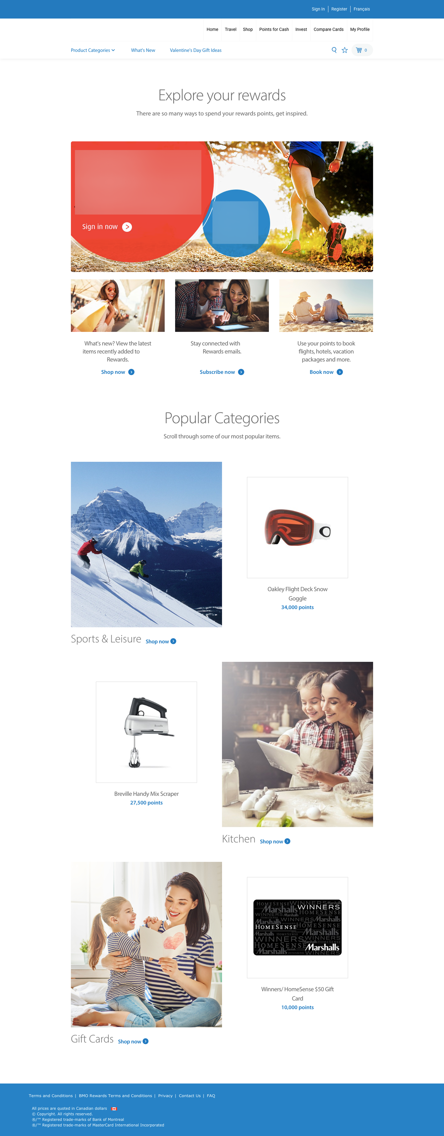
The previous store buried its own purpose. Distracting banners and ads pulled users away from the page, it wasn't clear that the site was an online store for redeeming reward points, and the products and categories were hidden away inside a nav menu.
Goals
Goal 1
Clearly convey the site's purpose from the landing page: an online store where reward-program members redeem points for merchandise.
Goal 2
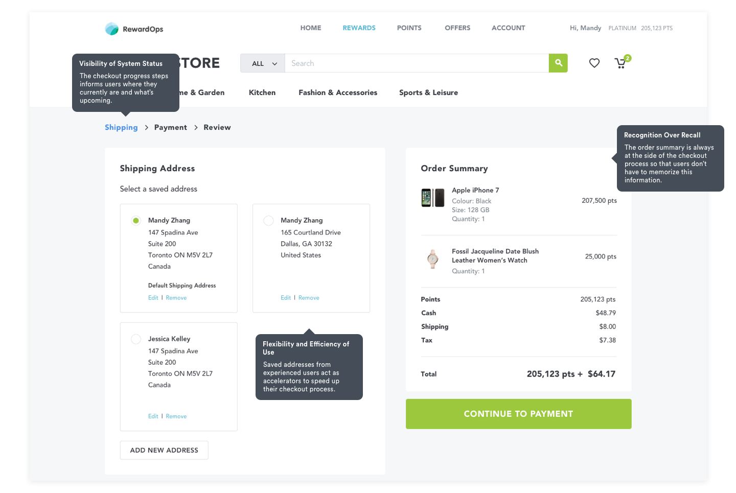
Create an intuitive, smooth experience from landing all the way through checkout.
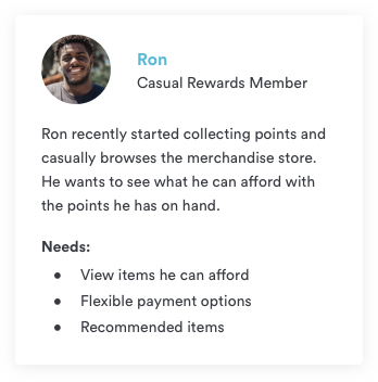
Research & personas
To ground the redesign in real user needs, I interviewed RewardOps' account manager, who worked closely with end users and understood their pain points well. From those conversations I built two personas to represent the people actually redeeming their points.

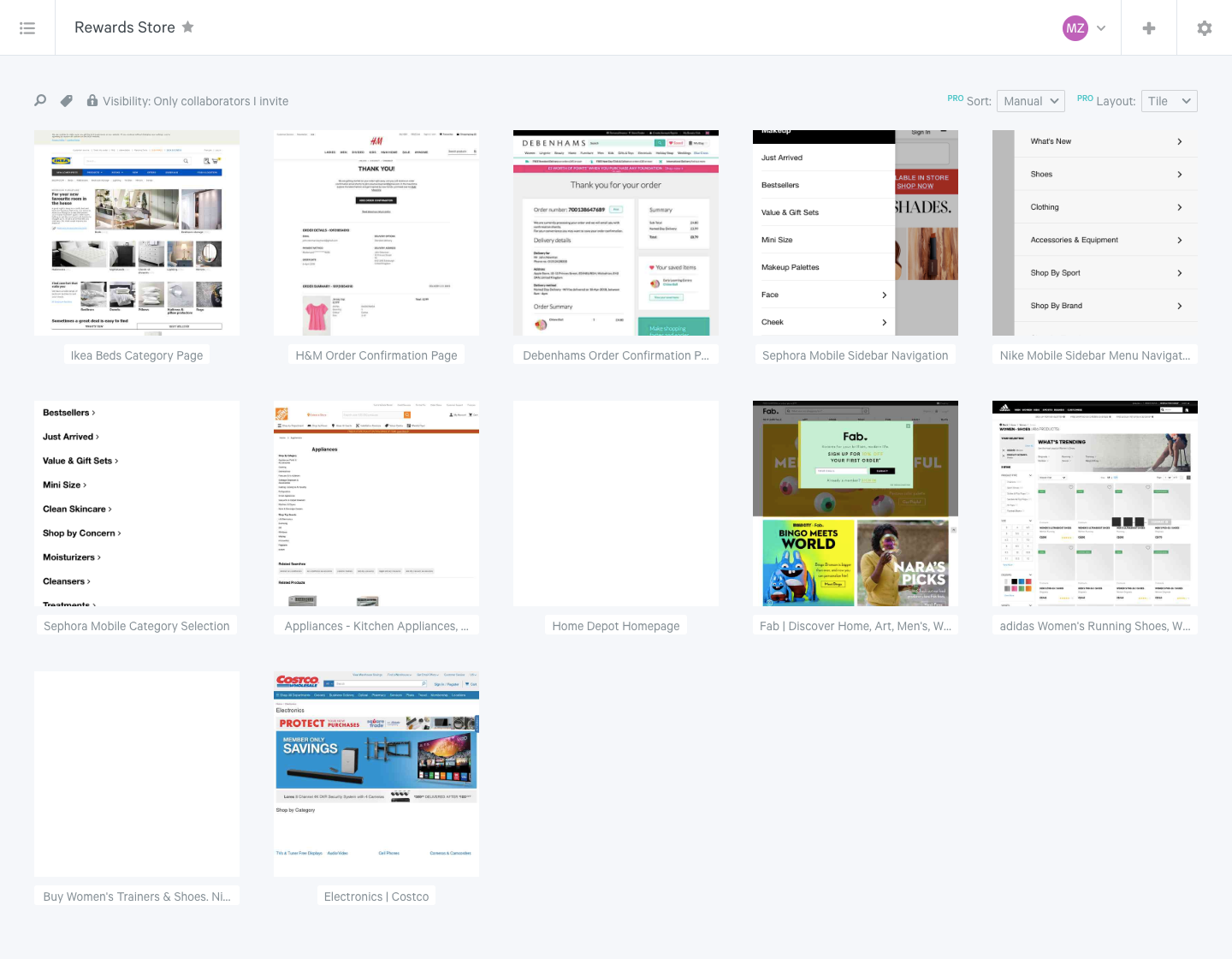
Competitive analysis
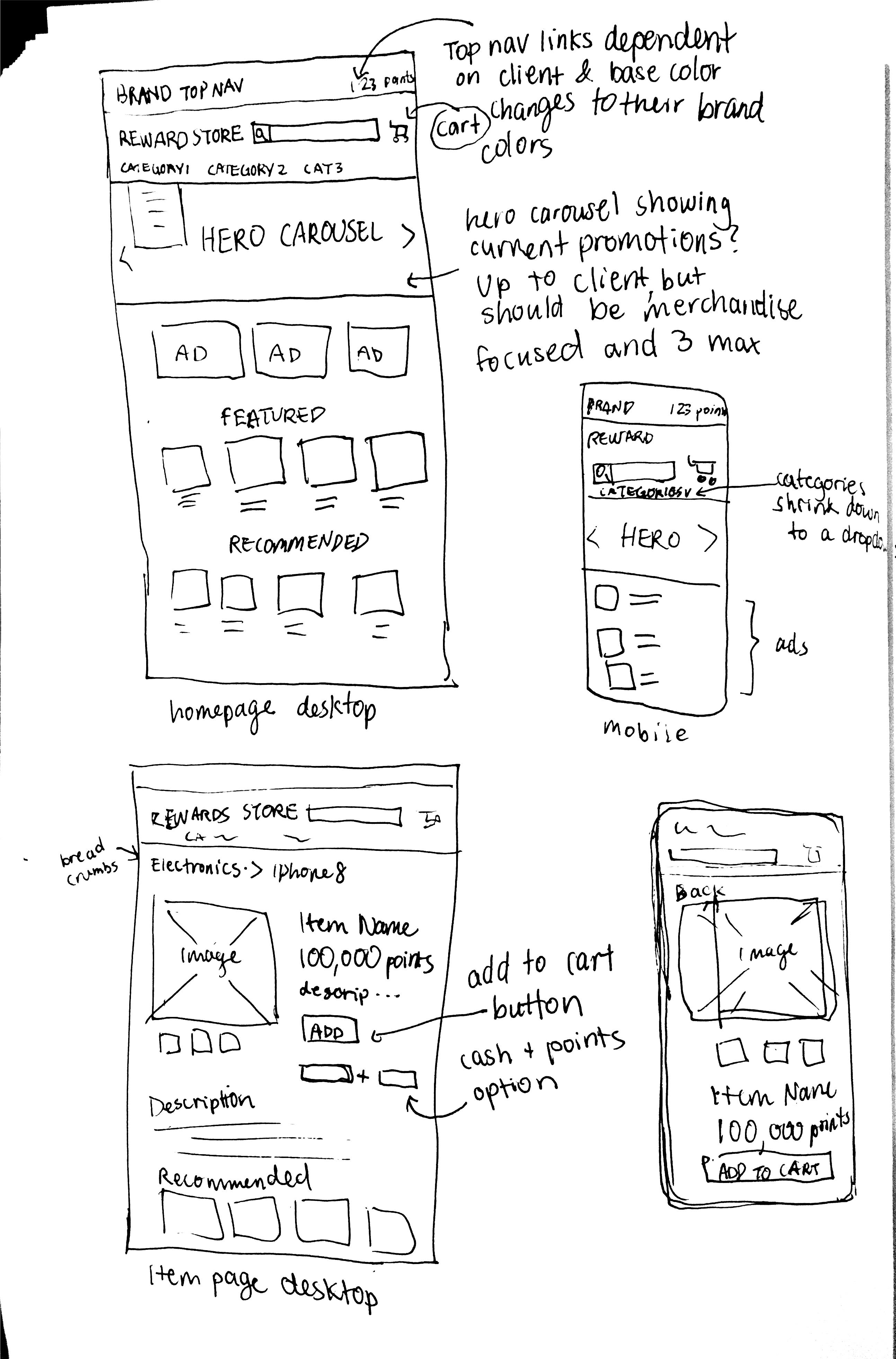
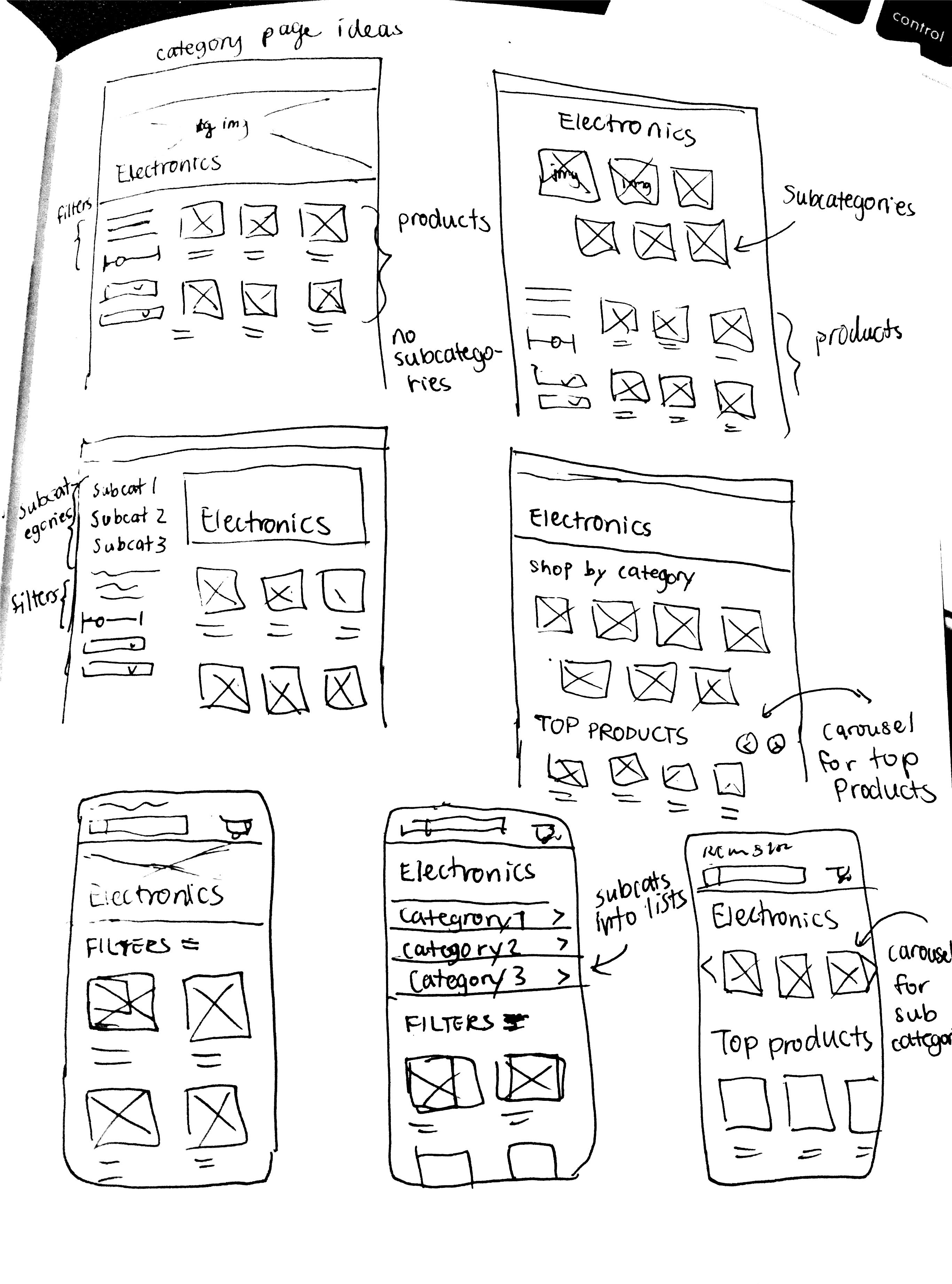
I studied established ecommerce experiences like Best Buy, Amazon, Sephora, and Aritzia, collecting screenshots of strong UX into an inspiration board. A few patterns showed up again and again: a hero carousel, product recommendations, and dedicated subcategory pages.
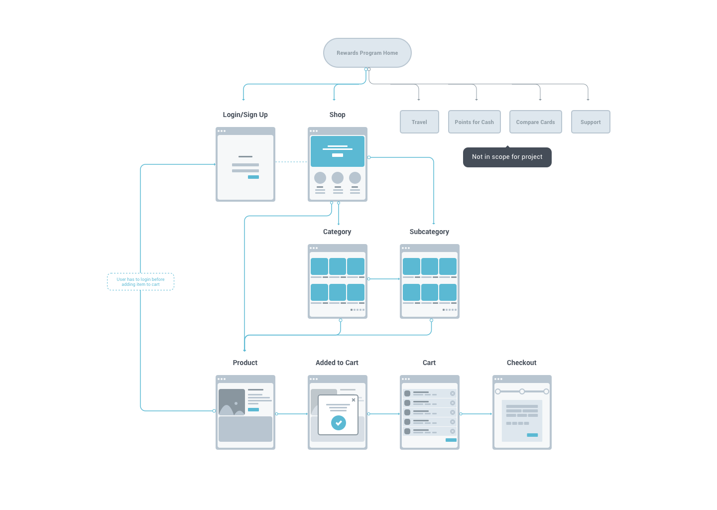
Information architecture
Using what I'd learned, I mapped a sitemap to define the store's structure and the flow from landing all the way to checkout.
Sketches & exploration
Sketching let me explore layout options quickly. The main challenge was keeping the layout responsive across devices, and balancing that against stakeholder requirements, like reserving ad real estate on the landing page.
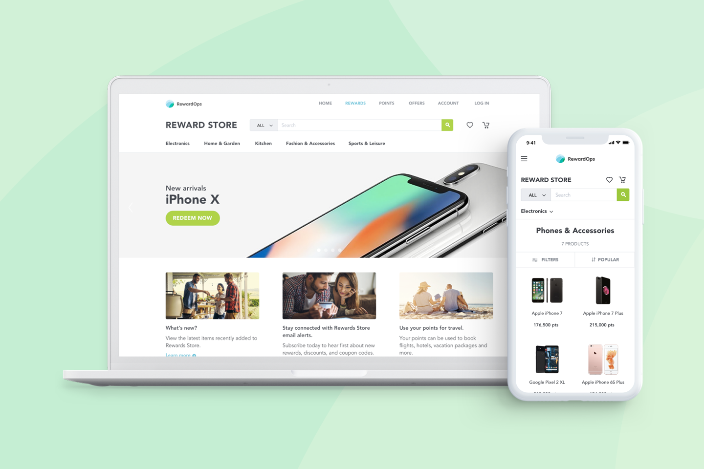
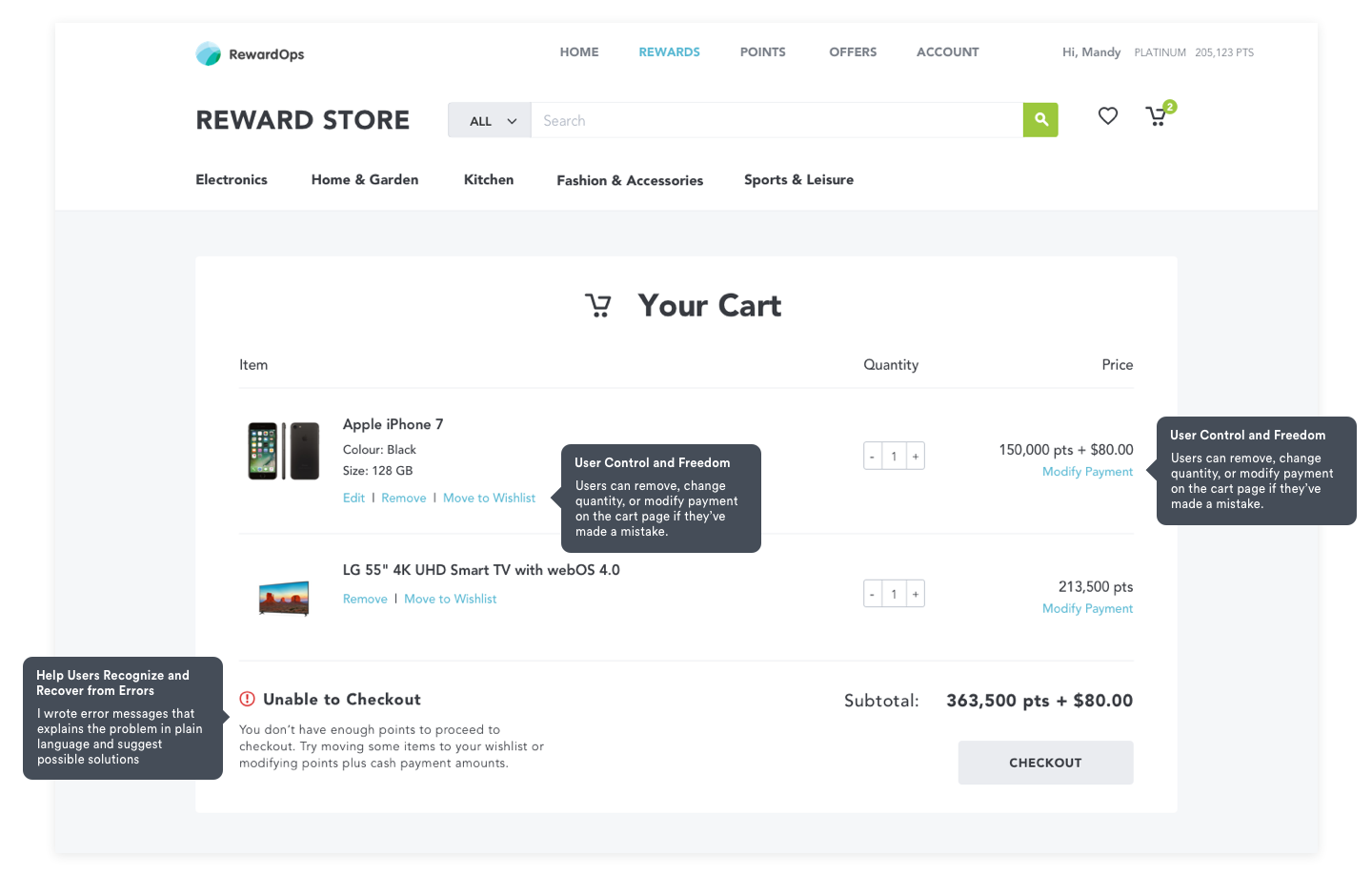
Final design
The final storefront leads with a clear hero and surfaces categories, recommendations, and products directly on the page, so members immediately understand they can browse and redeem.
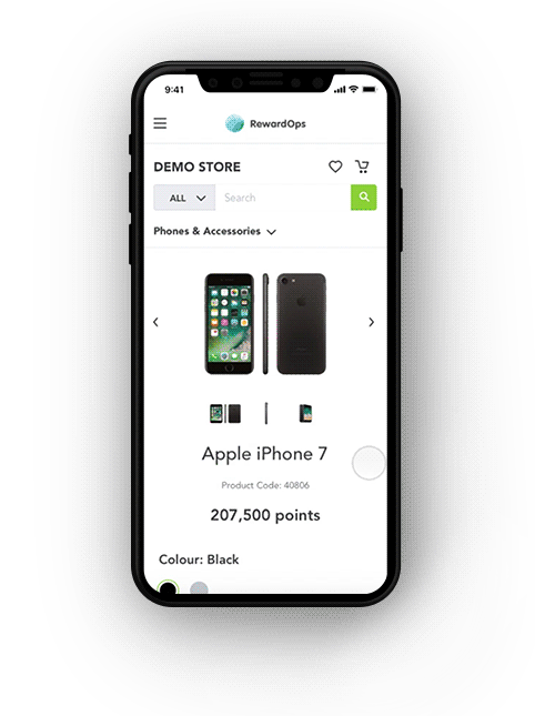
Mobile prototype
A walkthrough of the responsive mobile experience, from browsing categories to redeeming points at checkout.
Outcome
The redesign shipped as RewardOps' standard reward-store template, a flexible white-label storefront that clients could roll out for their own reward programs.